Visualizations
Statistics and visualizations
The Insights Dashboard displays the following statistics and visualizations:
-
Alert Summary: Number of alerts of each status (Critical, Major, and so on) and their incidence rate compared to the average for the selected time period (for example, "-15% Past 24 Hours").
-
Node Reachability: Percentage of nodes that OpenNMS can see and that respond to communication (ping, and so on).
-
Top Nodes: A sortable list of the most active monitored nodes on your network.
-
Total Network Traffic: A graph of inbound and outbound network traffic over the selected time period.
-
Top 10 Applications: A graph displaying the top 10 most used applications in your monitored network over the selected time period.
By default, information is shown for the last 24 hours.
View data on a per-node basis
If you are using SNMP, you can view rate of traffic observed on a given interface through the Inventory page on a per-node basis.
Available graphs depend on the data being collected and include the following:
-
Bandwidth inbound/outbound (combined graph)
-
Bits inbound
-
Bits outbound
-
Bits inbound/outbound (combined graph)
-
Public interface byte count
-
Node latency
-
Errors inbound/outbound (combined graph)
-
Azure node bytes inbound/outbound
To view graphs, follow these steps:
-
Choose Inventory in the left navigation menu.
-
Click the graph symbol on the node to view traffic graphs.
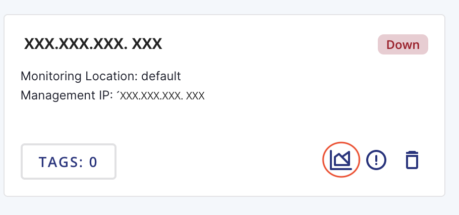 Figure 1. Node card
-
Hover over points on the graph to see details.
-
Click the download symbol on each graph to save a PDF copy of the graph locally or click Download All to save a PDF of all the displayed graphs.
-
-
Click the browser back button or an item in the left navigation menu to exit the node graphs screen.
Shortcuts
The Insights Dashboard includes shortcuts for the following:
-
The Inventory link on the Total Network Traffic graph navigates users to the Network Inventory page.
-
The Flows link on the Top 10 Applications graph navigates users to the Flows page.
Geographical Map
The Map page displays the geolocation of your Minion(s) on a world map, and indicates the number of nodes associated with it.
You must define a physical address or geo-coordinates (latitude and longitude) for the monitoring location to display nodes on the map. (See Create a location.)